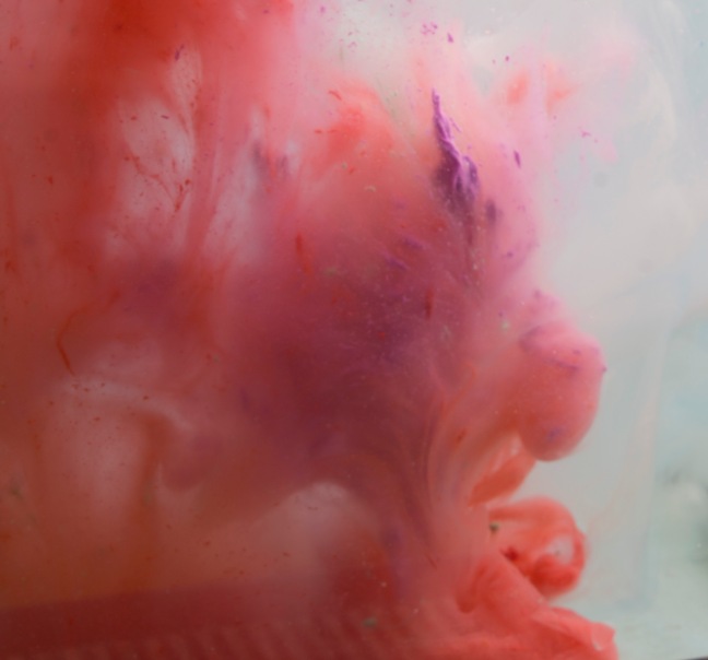
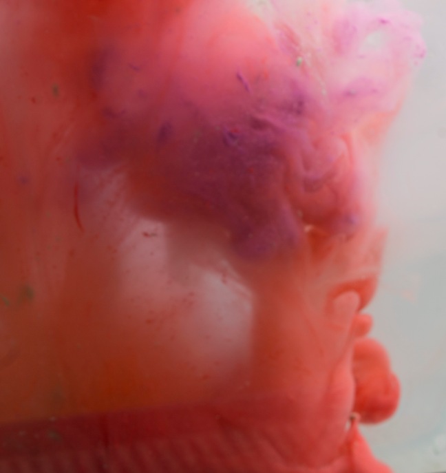
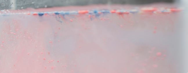
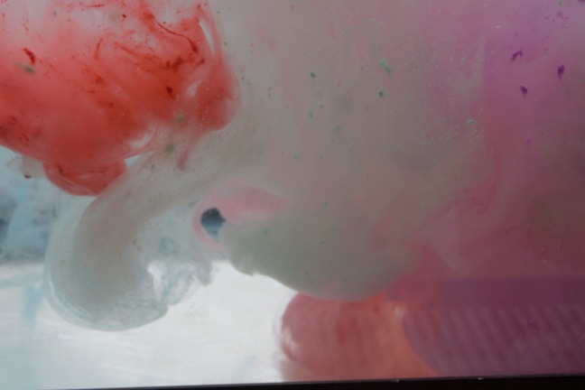
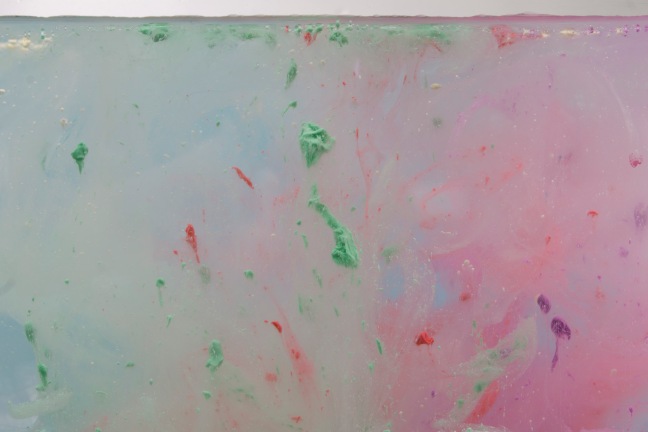
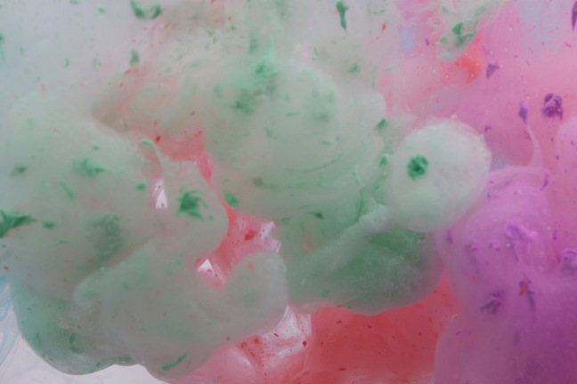
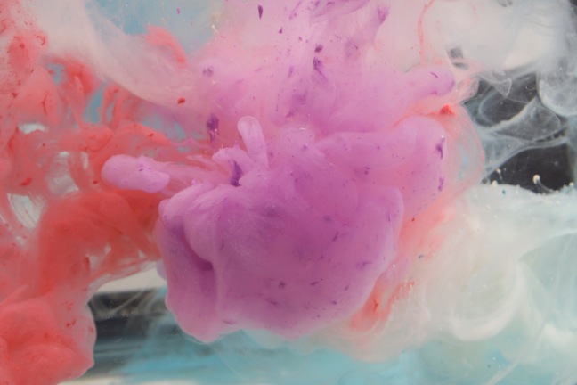
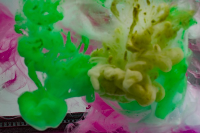
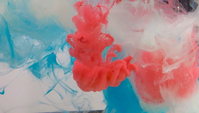
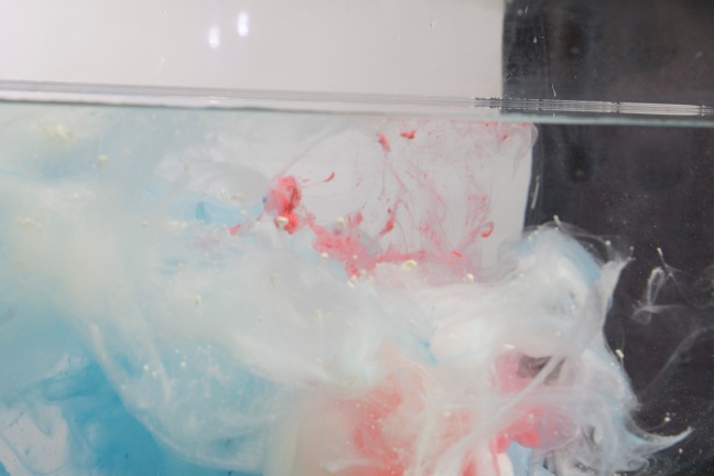
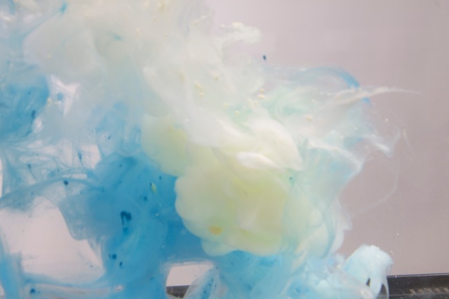
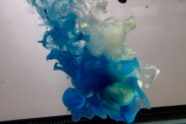
http://www.andrewhazelden.com/blog/2010/12/ink-droplets-falling-into-water/
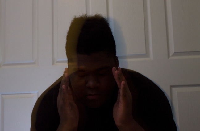
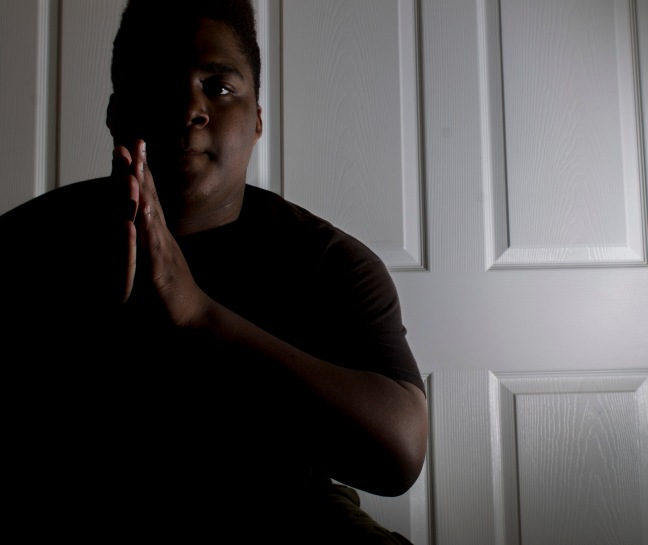
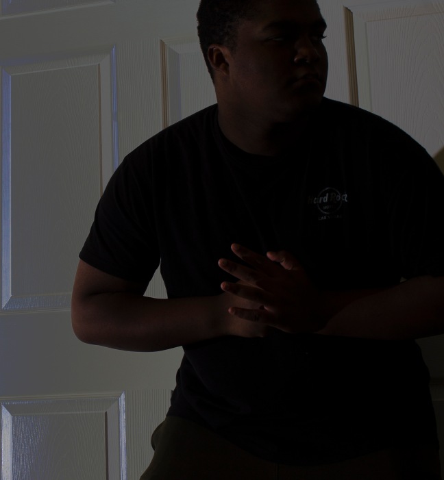
These photos are all bad because didn’t have the time to edit or find people to do it with.
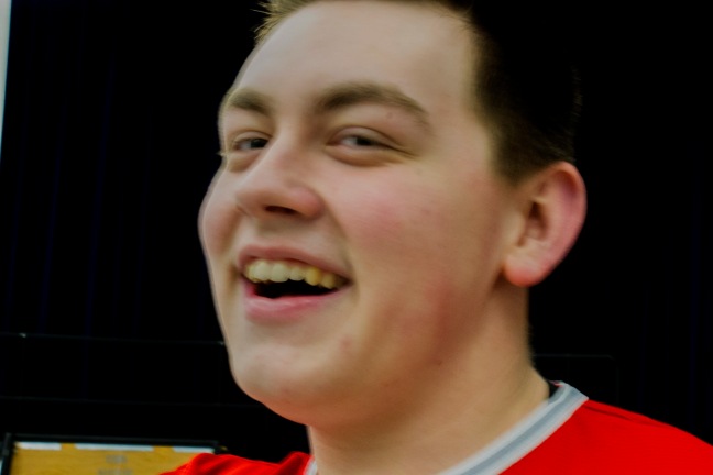
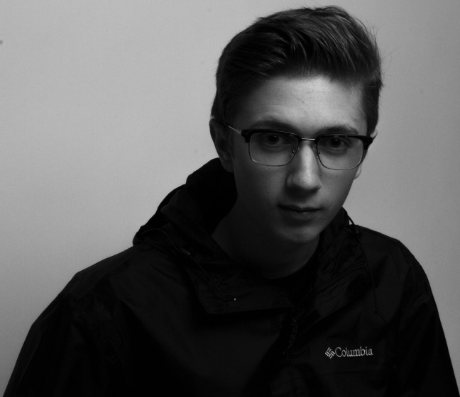
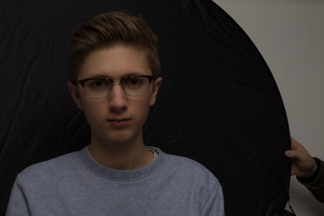
This one I turned down the levels in the background and turned up the levels for the person .
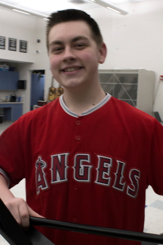
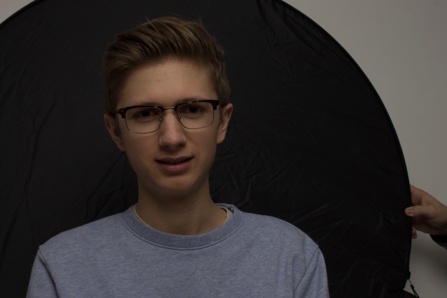
I did nothing to this photo because it the same one.
These are all photos without edits done. I tried to get it as good as I could but failed.
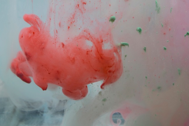
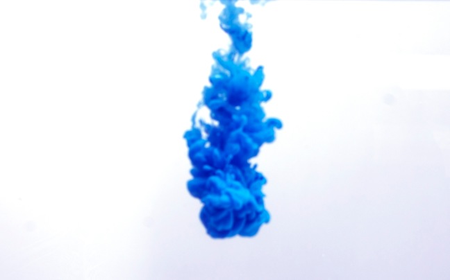
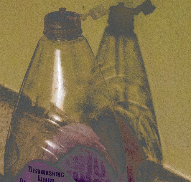
http://www.thisiscolossal.com/2016/05/living-works-that-flatten-three-dimensional-scenes-into-two-dimensional-photographs-by-alexa-meade/ I wanted to do something like this because it takes a normal picture and makes it a painting. I had no people to use so I used items randomly found.
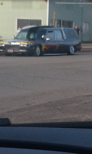
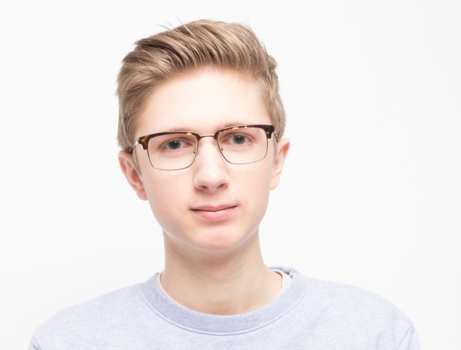
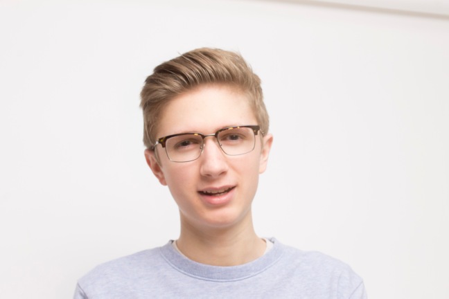
This is the original photo. I didn’t do anything to this photo. I took this image when I was out about to go home.
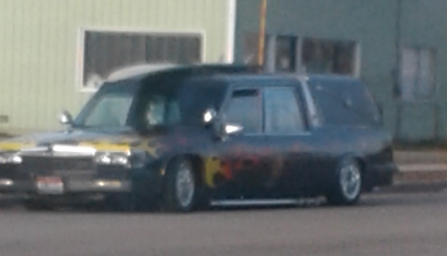
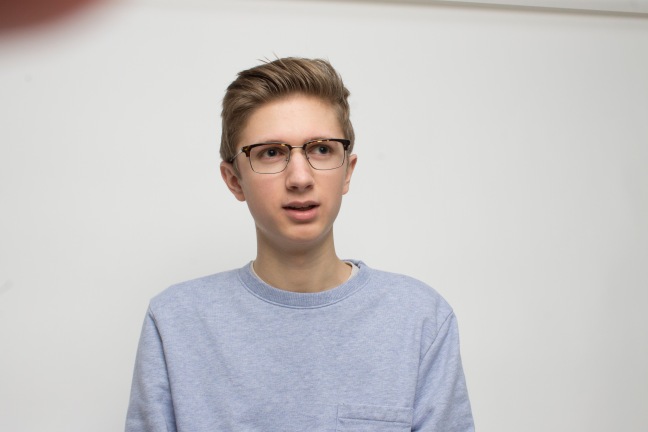
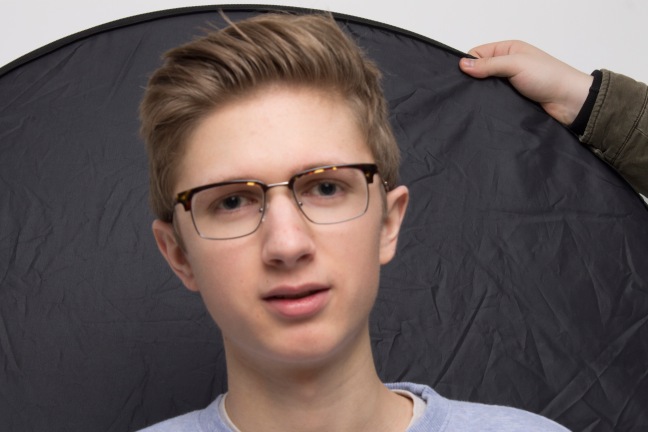
I used the healing tool on this one to erase the person in the background. That is the only thing I did in this photo.
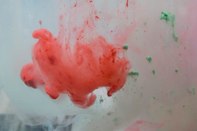
I used another layer with shadows and highlights. I used the high pass setting with reducing the noise. Used filter gallery to find a paint setting that wasn’t to messed up for this photo.
This photo I just matched the color and used the brush tool to only make one part color different.
This is the original photo I took on my phone.
I took this photo on my phone.
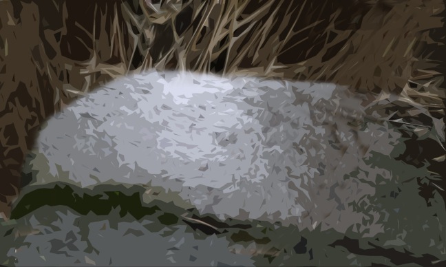
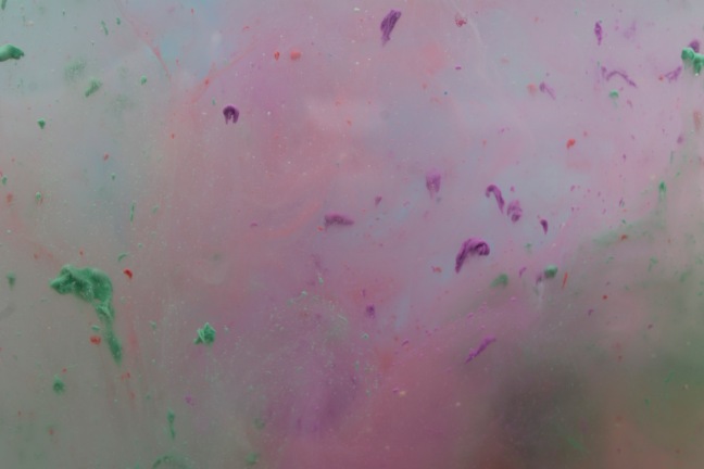
I did the same thing to the other “painting” picture but with different gallery. I copied the twigs and make it seem like a simple thing. It makes it looks like it was taken in another place on the world that covers the granite spots.
I really had no photos because I did absolutely nothing over break. I forgot to turn in my photos for my photo in the photos so I had nothing to turn in when all my photos were on the mac.
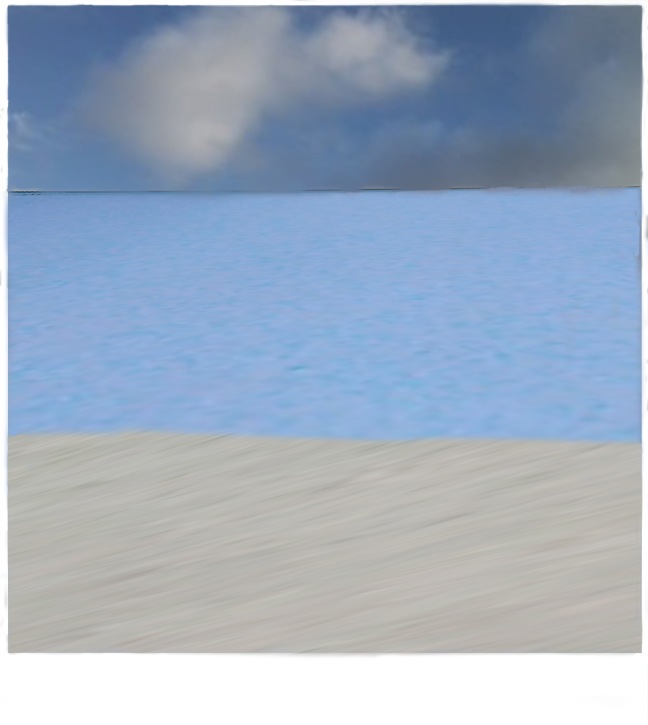
I wanted to do some type of picture frame of a beach that I made up with the shy and wall. I had to to box around it to have that effect. I spent most of the week touching this up on how I wanted it to look. It not that good. I lightly touched up the colors in this one.
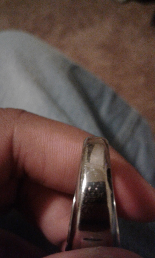
I just took a picture of my dads ring that he had given me over break before I was working.
http://www.houzz.com/narnia-wardrobe I wanted to do something like this because it is interesting. I didn’t really know what to for this week.
This is the one I wanted to choose.
This I took with my phone. I added white because it reminded me like heaven.
This is another picture I took on my phone.
platonphoto.com I wanted to try it again with dark background.
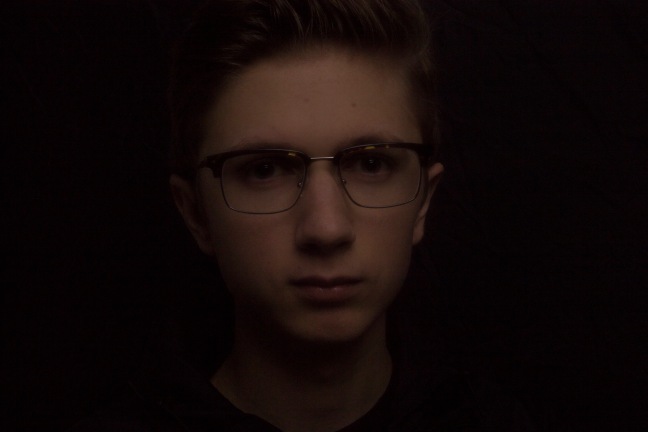
This image I took the levels all the way down and did black and white to get something better. It didn’t look right without the black and white. I did somewhat of an shadow of what plato did.
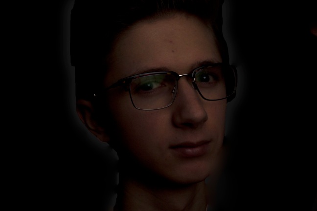
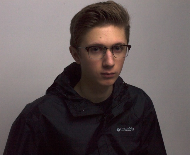
I did black and white to this one because it seemed right. I brought down the exposure and the black. I brought up the white a bit with the highlights. The contrast in this image is a little off because the jacket is darker that rest of the body.
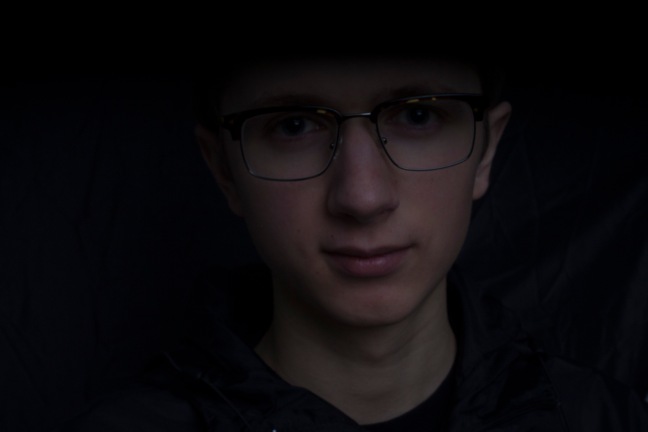
I played with the exposure to get the face to pop out than the rest.
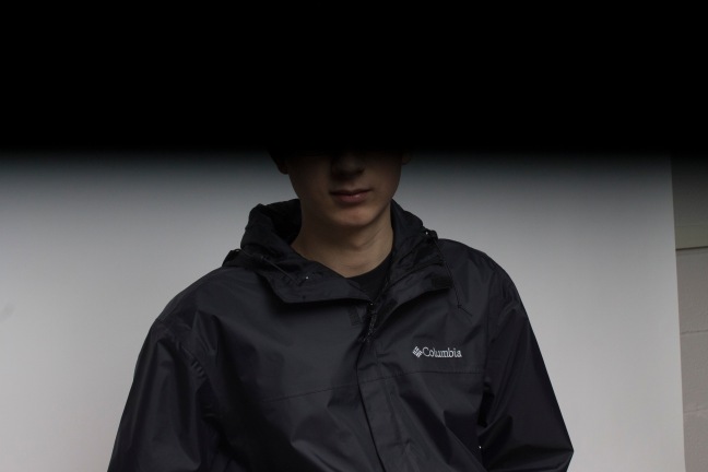
It was a bad idea to do the outer glow in this photo because it doesn’t match the person.
These are all my mess up that I didn’t play with.
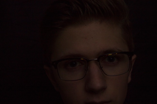
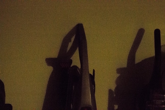
This photo gives a sense of mystery behind the shadow with such a serious look.
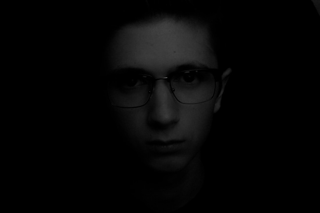
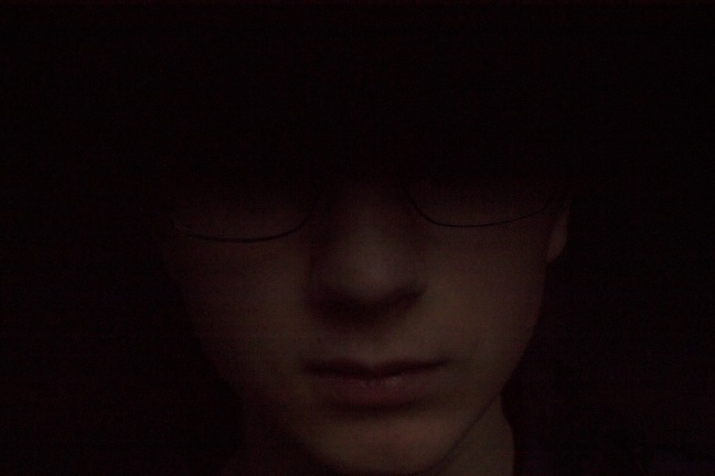
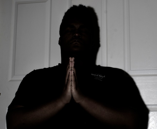
This shows darkness and evil this one. It is darker than the others because it seemed right for the portrait. Not a lot of brightness in the portrait but it suits it just right.
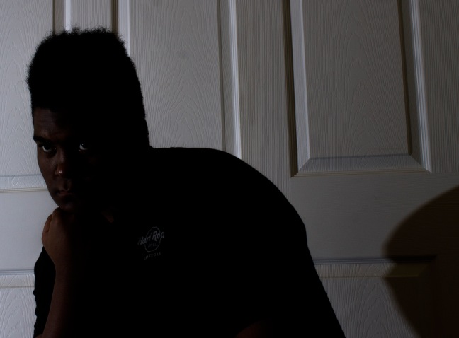
I didn’t play around with this one because it looked ok.
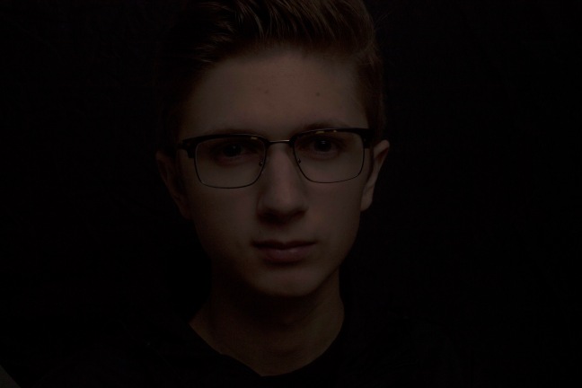
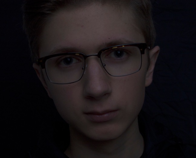
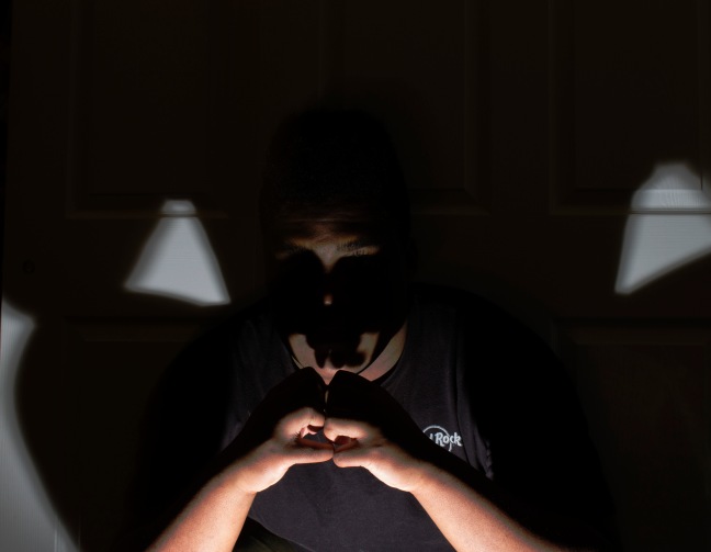
This shows how the person could be really serious and has maturity.
I just brought up the exposure and the white in this one because looked right.
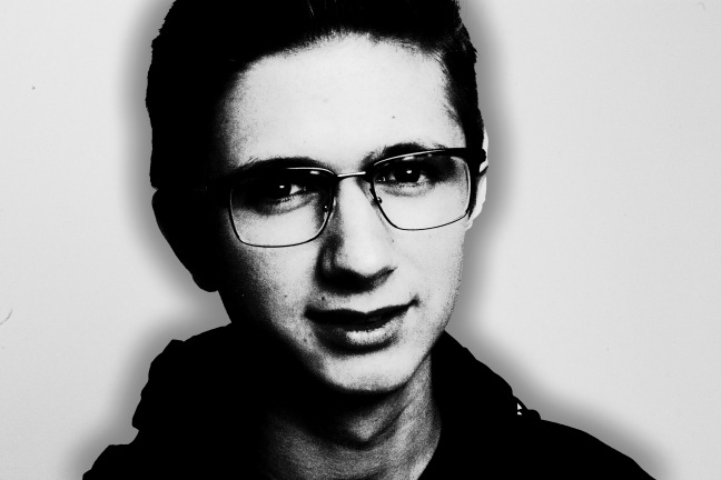
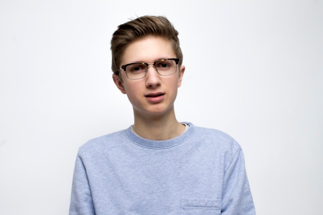
platonphoto.com I tried to get the portraits as close as I could.
This one I have fully edited as close as possible to get the same as Platon did but didn’t have that much time. I had to add black background from paint because my settings were higher that I thought it was.
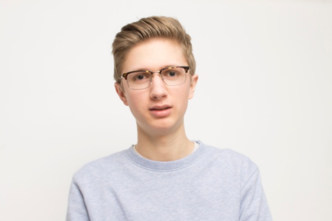
This was the original image that I thought I had the right settings. This one was the darkest I got.
I keep changing the shutter slower to get some light in but I got to much. It hard for me to guesstimate the right one. Could not zoom in the photo as much as I wanted to do. I got more space than I need but had barely anytime to do all of the photo edits in two days and a half.
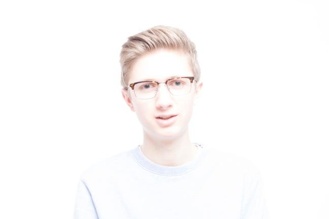
This one is at an alright brightness to get the white backdrop as white as possible without affecting it in the process. I had this at an angle and zoomed possible to get the white background. There is more space than I needed in this photo.
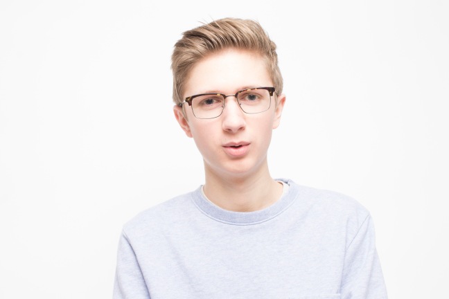
This one I had got it really bright but the white would mess up the portrait. The contrast is pretty weak in this one. It doesn’t have a balance of color in this because of the white taking most of the space.
The blacks and shadows in this one made it hard to keep the hard normal as possible. The hair doesn’t seem right in this photo but I did small edits to this one.
Getting this one to do edits with was hard when white and black shadow was not easy to edit in raw even while masking. This is a more unbalanced photo from the light.
This one is the worst to do because I couldn’t edit all of the white in this one. I keep opening the shutter and turn up the shutter on the light.
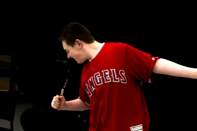
I got this while he was talking hoping to get the right timing to take.
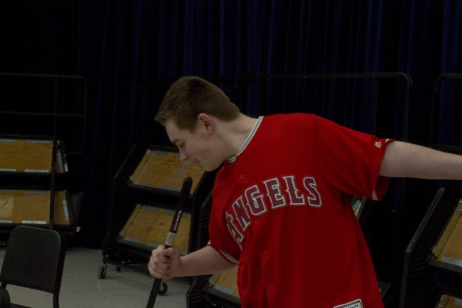
Another image I was hoping to get right time.
This one is a more zoomed cropped version as best as I could to hide most of the things.
Bad timing and too bright in here.
This is too bright and I got this while he was talking again. Doing what Platon does is not easy to get in limited time.
Lighting Patterns in Portraiture – lmwelkley https://carolinavieiraa.files.wordpress.com/2011/01/5-tips-to-improve-your-portrait-photography5.jpg These were my closets inspirations that I wanted to do. One light was a bit complicated to do one my own.
This image I took on my phone which I had to do. I played around with the points while I was editing in photoshop raw. It was cool that I got this look because I wanted to get something I never tried before for the photo. It gives it a bit more pop to the image. The texture looks smoother than before it did.
I wanted to do black and white for this image because it seemed right. I took this one with my phone again. The shadow was just there so I took a picture of it. Contrast from the image is ok. It is not to bright or dark.
This is another one I took on my phone. I tried to get a bit more shadow with one light that I had but it didn’t get me the image I had in mind. I just like to use black and white when things seem good to me but this one isn’t really that good. The contrast in the image doesn’t seem right.
This one I had taken with my camera and underexposed it by accident. It was hard to do when I was opening shutter and iso. I couldn’t do anything about the red lines in the image.
This one I got the right exposure. I wanted to get another object with shadow because I like shadows.
This one is pretty cool. I was trying to get a small shadow with an evil look. I took this in front of me with a timer for 10 secs. Really liking the shadow in the background that kind of look like a beast that has an aura around me. I had to play around in photoshop with the levels to get this effect.
This one I took in front again with 10 sec timer. I used black and white and levels to get this. I like to hide faces because it gives me some meaning in it. This one was easier because nothing was unbalanced when I was editing.
I took this one with the flash to the left way back for me. I wasn’t really what I was hoping for but it was what I got. I used levels to get less face to give some of that evil in there.
This one was unexpected. I moved while it was shooting and I got this. I didn’t do much to this image because it was ok. I took the flash in front. The background doesn’t fit the image which I am not liking.
I had flash to the right closer to try and get shadow but didn’t. The white in background is bright so it doesn’t fit.
This one isn’t good because the image is to dark to do anything.

The camera was lower that I was. Again the light was far back to the left. The shadow in background wasn’t what I want.
http://elguanche.info/eleinfo-eye-reflection.html http://www.photoshopessentials.com/photo-effects/sunglasses/
http://www.wall321.com/People/Close_up/closeup_photography_sunglasses_reflections_faces_1920x1080_wallpaper_29583 These are my links to inspiration. It took me a while to find something that I wanted to do for my theme for the final blog.
This is the portrait I wanted to do. The image is well balanced with its sides. Contrast in color were a bit dark. I took this image in a straight angle. There is plenty of space in the image from all sides in the portrait. I added some darkness in the back to just get the main person in detail. It took me awhile to balance out all the colors.
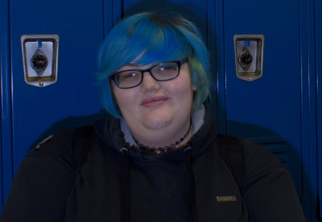
My location portrait is not that good but has some elements in it. I played with the lighting a little bit just to get something close of what I imaged. The shadow in the background adds some meaning in the portrait. When I took the image it was at an angle but cropped it out to take away most of the space to get head shoulder portrait. It was a big challenge in getting this photo with a lighting kit. You can see the light reflect off the glasses.
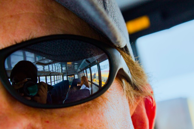
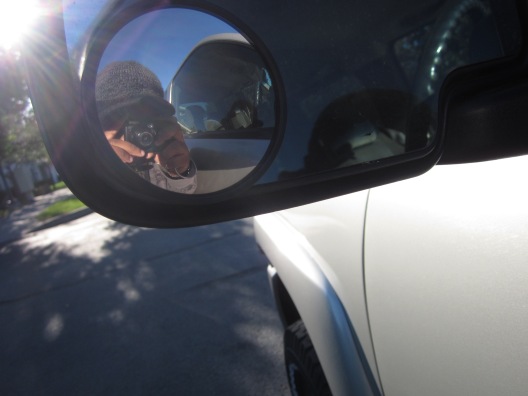
This one I did not do much to this photo. I unsharpen the image to get some texture in the reflection. I took this photo at 1/125, f 8 and don´t remember the iso. I brought up the color of blue since the seats were blue in the image. There is plenty of space in the image to get the reflection as the main focus. Wanted to get most of the image edited to add a little something to the image. Focus of the image was what I wanted it to be in my mind.
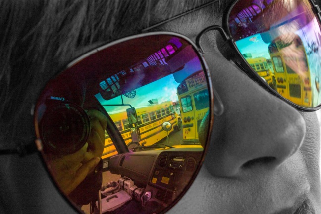
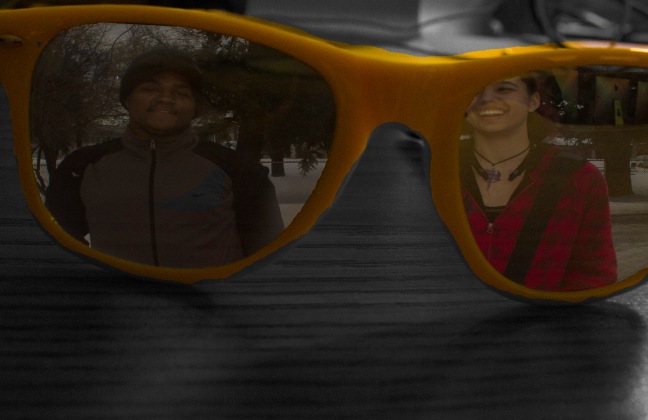
This image I did little bit more to get black and white background. The glasses colored and the rest black and white makes it image better in a way. It has less space than the first reflection but it does the trick. You see what the glasses is seeing from the outside. I got this image focus just right. The exposure is not too dark or light in the image. Balance of colors is matching the person personality.
I did a black and white reflection because to me it has more meaning behind it. Colors are not that much of a match for the black and white. It was hard to get this photo when I first tried it in a dark space. Focus was what I wanted it to be.
I wanted to add a moment in the glasses. I had to move the image to make it as even as I could. There is plenty of space to catch the main image in the glasses. I could not get the glasses more yellow with out effecting the image.
I could not edit the levels with out messing up the whole image. The whole image was all dark so I could not brighten up the image without the image looking all funny. I does not look natural when whole image is off so I just left it alone editing once.
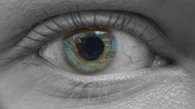
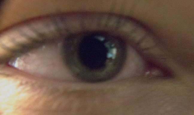
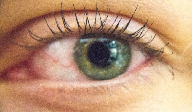
I got the main reflection in this one as well. This image caught more of the reflection and camera bounding off of it. I got the main focus in the image which I played with the camera settings to add things to it. You see more of the eye when opening up your eyes.
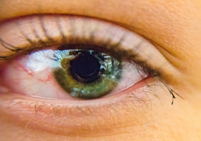
I like this one better because it got more of the reflection in the eye. I got the main focus which was the eye. It has plenty of space to catch the eye. Had to take this in a bright room to get it to work out. The darkest part of the image the top of the eyeball. Lightest is the bottom left side of the eyeball. One side is lighter than the other but it is well balanced from its color. The eye lids frames the eyeball and the eyeball frames the reflection.
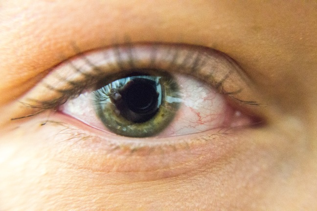
This image is blurry and could not get the reflection.
Throughout the years and many months of taking different photos I picked the most one I believe is the best work I did. Some are arguable but this is my opinion on what I think on the photos.
This photo is my top favorite because the way the colors all match to create a nice light over the main object. This photo having soft lighting make the colors pop out. Got this idea from a chick that never really likes to show her face but other objects and people.
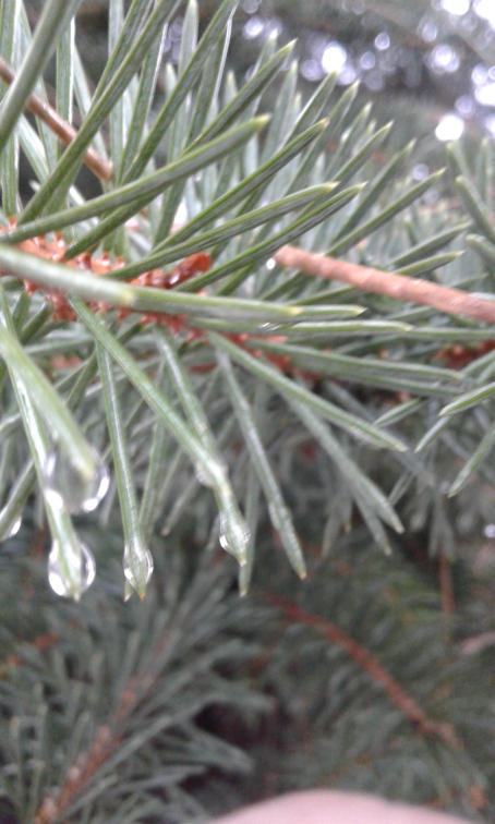
I like taking macro photo because of how the close the image gets and the way the colors blend into each other. The way the shadow in this image is. The brightness is not to bright or to dark for the image. Contrast in the image is just all matching.
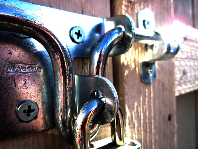
This photo is cool because I turned down the levels. Contrast is blending. Texture is smooth and got a bit of a street light lighting for the lock.
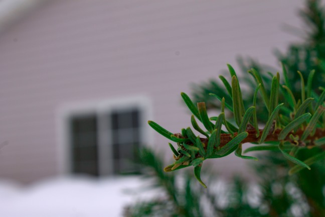
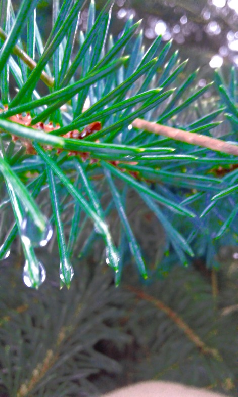
This is I took from a tree just sitting out during the break. The colors are green like I wanted it to be. I changed the colors to get more green in the photo than it was before. Background is blurry like I wanted it to.
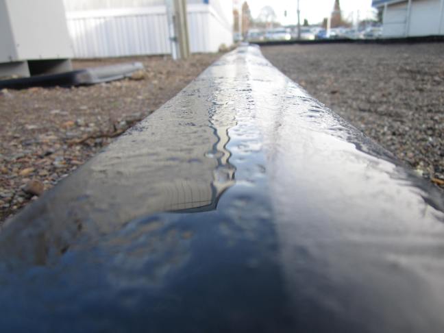
Leading lines was always interesting with it fading off in the distance. It has a bit of a reflection in the water. I could’ve done a better leading lines photo but all my others looked off.
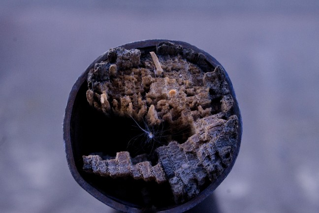
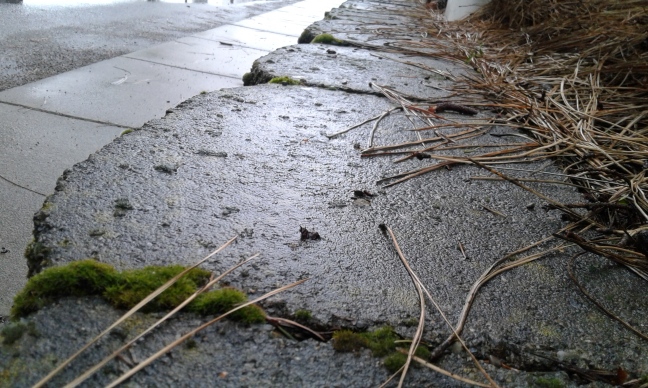
This photo I took of something. It caught all the main textures in the image that I was trying to get.
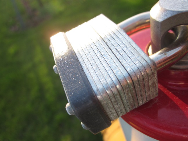
The colors in this photo is ok. The way the light is on the the lock adds something more to the image. It was a bit of a challenge to get this photo. I had to play around with the exposures to get it the way I wanted it to look.
